01
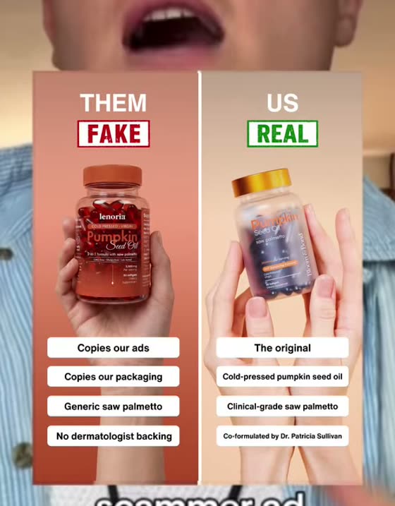
Scammer ad
Split frame naming a named counterfeit on one side and the real product on the other. Weaponizes a fraud the buyer already fears.

Most creative briefs die on a blank page. This is the opposite: every format we have seen carry spend, paired with the actual ad, tagged by the job it does, and linked to brands still running it today. Statics first, then the video hooks.
These were called out separately as the statics actively carrying spend at the time of capture, not just formats that exist. If you only build five things this month, build these.
Split frame naming a named counterfeit on one side and the real product on the other. Weaponizes a fraud the buyer already fears.

Handheld phone photo of the result with handwriting over it. Deliberately unproduced so it reads as a person, not a brand.
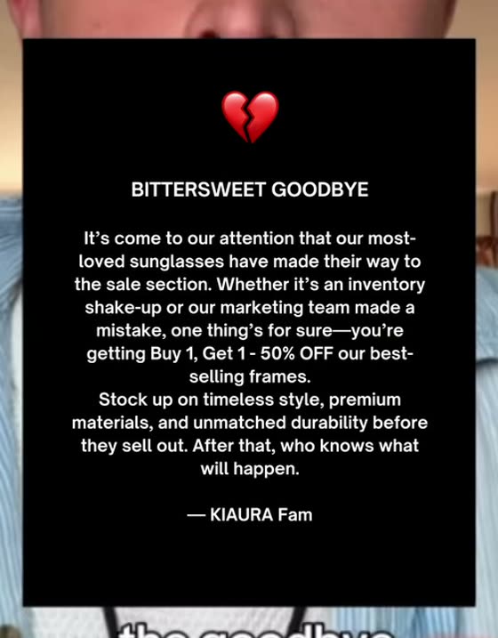
Black card, broken-heart emoji, a retirement-sale letter signed by the team. Urgency dressed as an announcement, not a discount.
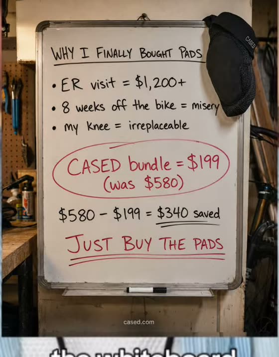
Cost math written by hand and photographed: the expensive outcome against the cheap prevention. Arithmetic does the persuading.

Editorial news card plus a LEARN MORE button. Borrows a publisher's authority for a claim the brand could not make alone.
Two jobs sit underneath all forty. Camouflage formats borrow an interface the feed already trusts, the Notes app, a WhatsApp thread, a Reddit post, a story screenshot, and they hold up on cold traffic. Claim formats interrupt with a statement the viewer has to resolve, and they pay off on people who already know who is talking.
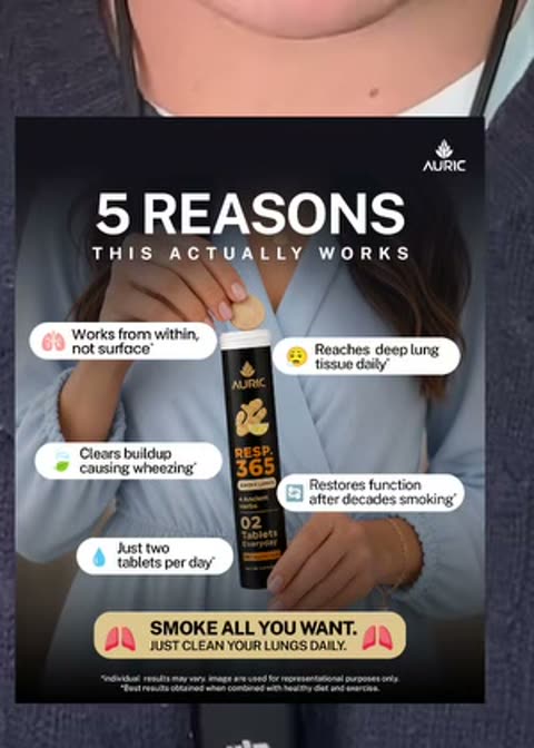
Numbered reasons stacked over the product. "5 reasons this actually works" — a countable promise, cheap to scan.
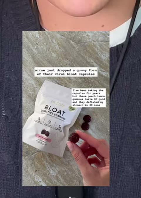
A story with the poll sticker still in it. Reads as someone else's screenshot rather than a placement.
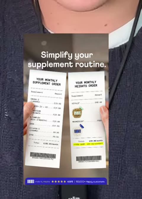
Two receipts held side by side, theirs long and yours short. The comparison is physical, not a table.
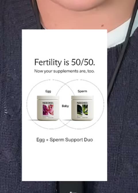
Two overlapping circles making the argument that the category ignores half the problem.

The brand tells you not to buy its own product, then qualifies who should. Refusal as a filter.
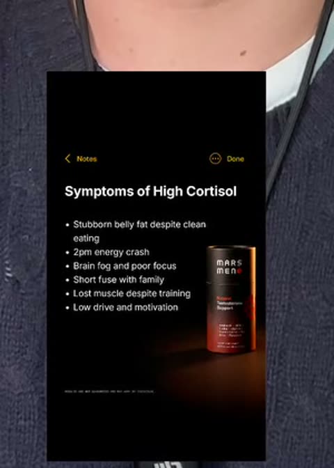
Apple Notes on dark mode listing symptoms. The most copied camouflage format on the feed.
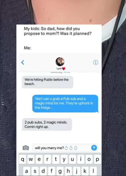
An iMessage exchange where one friend recommends it to another. The sell is overheard, not delivered.
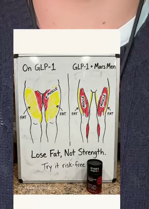
Marker diagram comparing the standard path to the standard path plus you. Handwriting signals no ad budget.
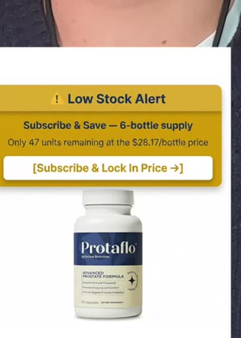
Selling-out banner across the pack shot. Scarcity stated as inventory status rather than a deadline.
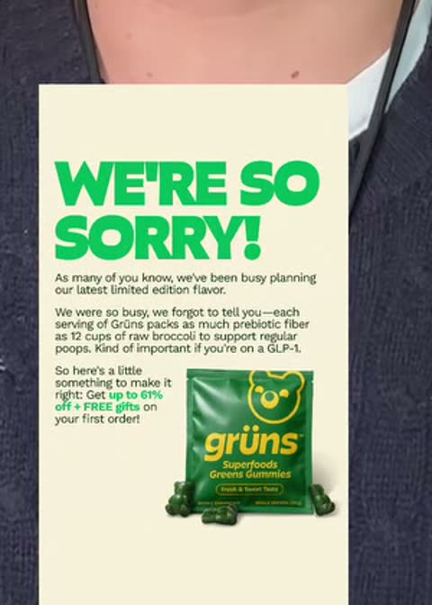
A public apology card. Whatever they are apologizing for is the benefit — sold out, too popular, too strong.
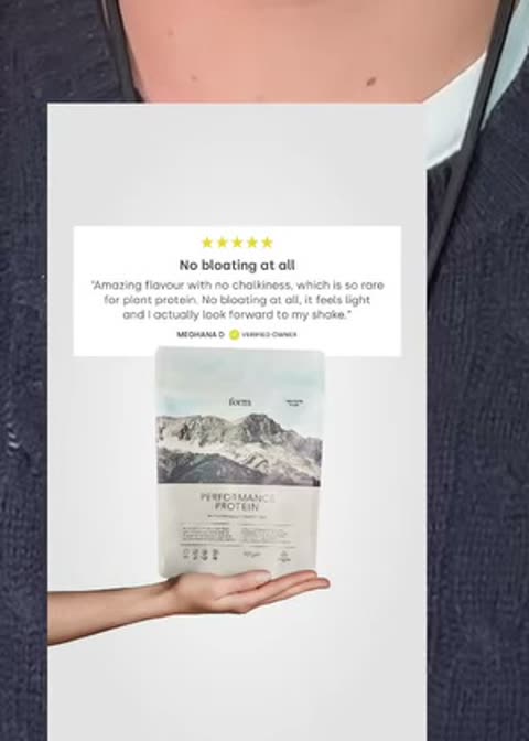
Product photo with one pulled review quote set large. Single objection answered per ad.
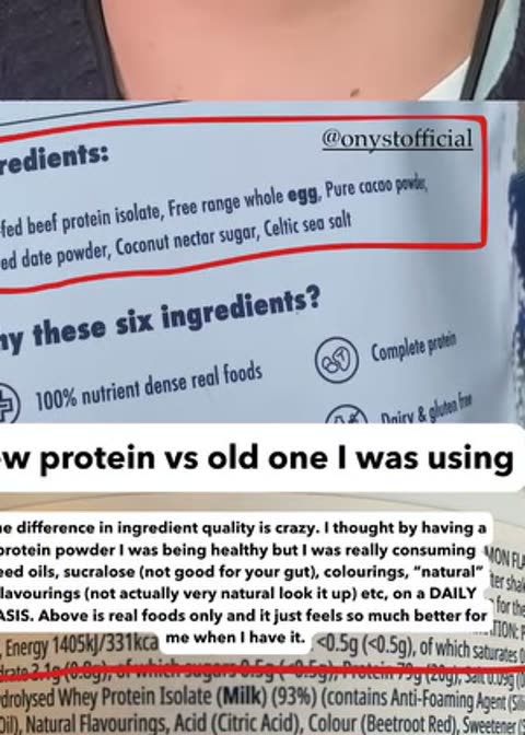
The category's old form beside the new one. Frames the purchase as an upgrade decision, not a first purchase.
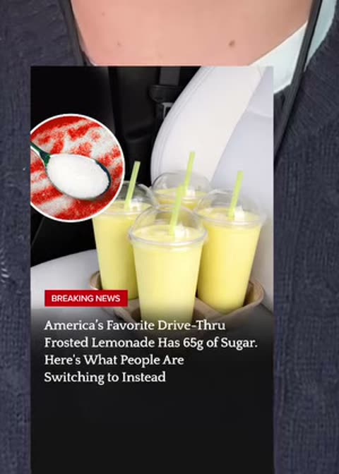
News-card layout attacking a household product by name. Borrowed editorial authority for a hostile claim.
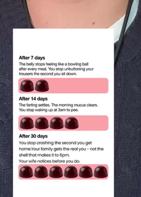
Day 7 / 14 / 30 across one strip. Makes the wait explicit so the buyer sets their own expectation.
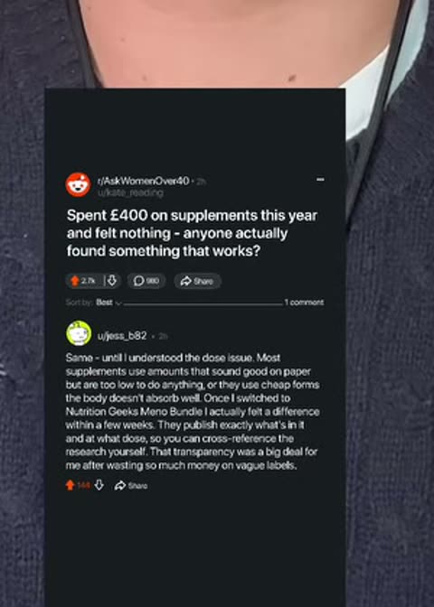
A fabricated subreddit thread with upvotes and replies. Peer advice rather than brand advice.
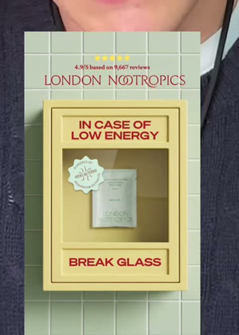
Break-glass box holding the product. Positions it as the thing you reach for at the worst moment.
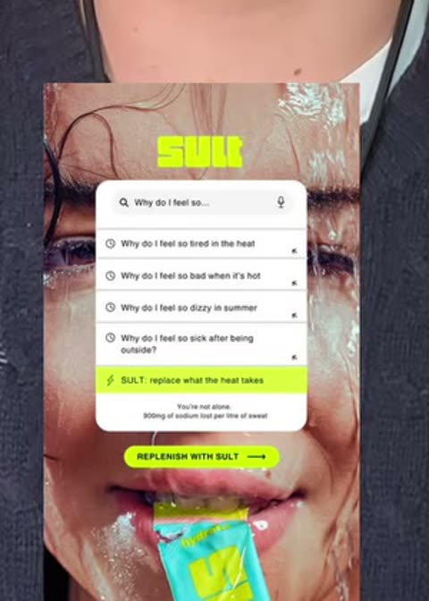
Autocomplete dropdown finishing the customer's own symptom query. The demand is shown, not asserted.
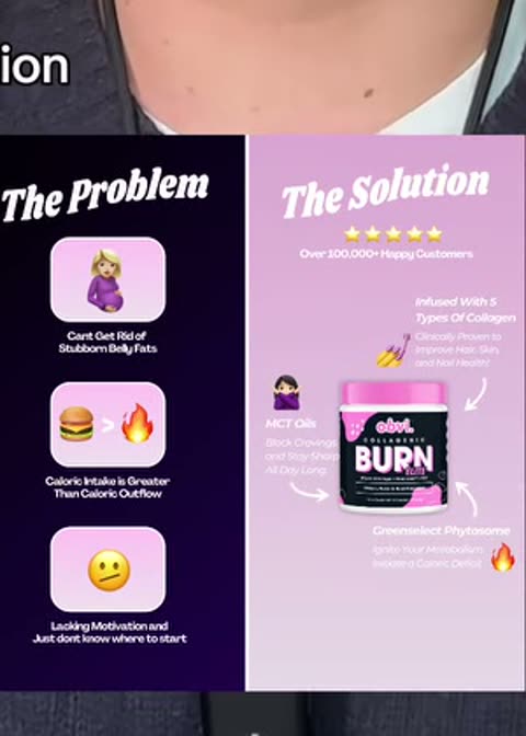
Hard split, ugly left and clean right. The most basic compare and still the most durable.
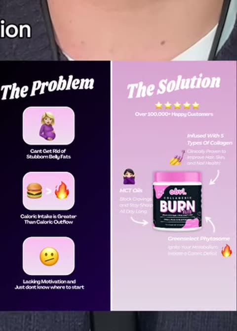
The benefit written as a warning. "Cravings may disappear" — reframes a claim the ad could not make straight.
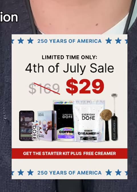
Flatlay of everything included with the strike-through price on top. Value shown by count of objects.
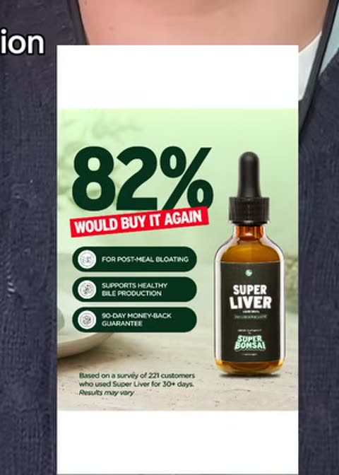
One number at display size with the source line beneath. Needs a real figure or it reads as decoration.
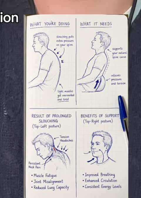
Rough sketch explaining the mechanism. Amateur drawing buys attention that a render does not.
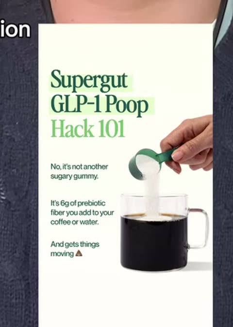
Framed as a trick being taught rather than a product being sold. Teaching posture, purchase outcome.
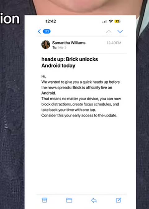
An announcement email captured as an image. Inbox layout signals company news, not paid placement.
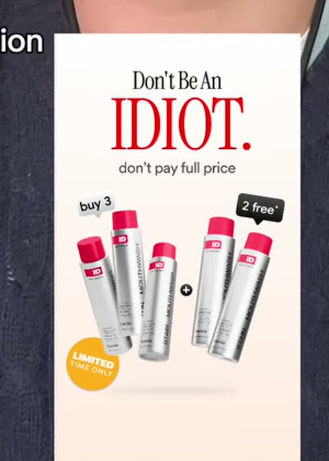
Insults the buyer for paying full price, then shows the multi-buy. Aggression as a price frame.
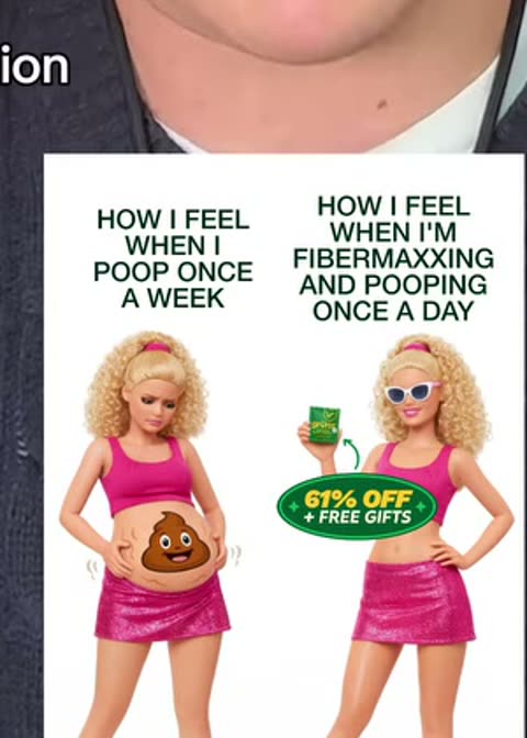
A current meme with the product edited in. Short shelf life, near-zero production cost.
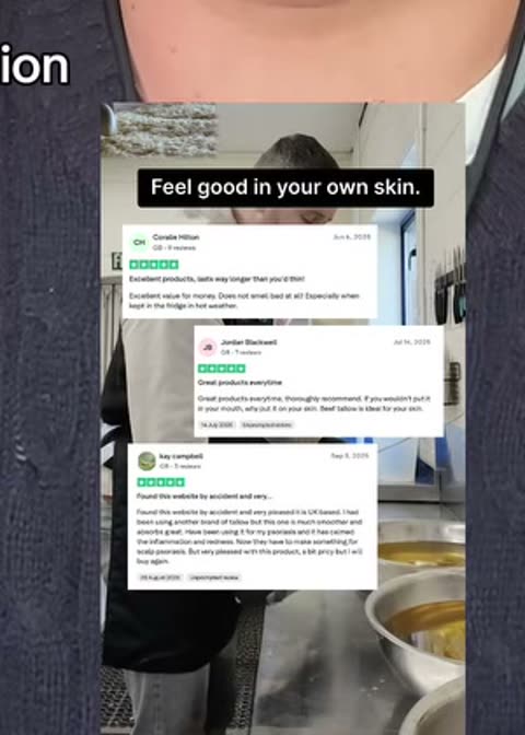
Three review cards stacked with stars and reviewer names. Volume of proof over depth of proof.
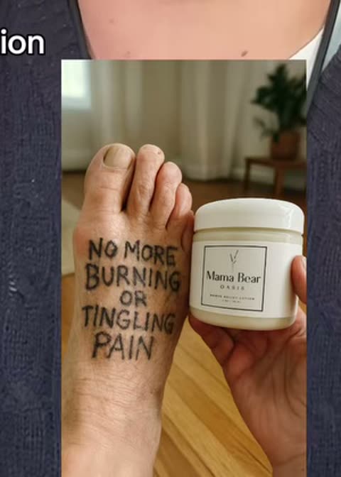
The claim written in marker on the body part it treats. Puts the copy inside the photo.
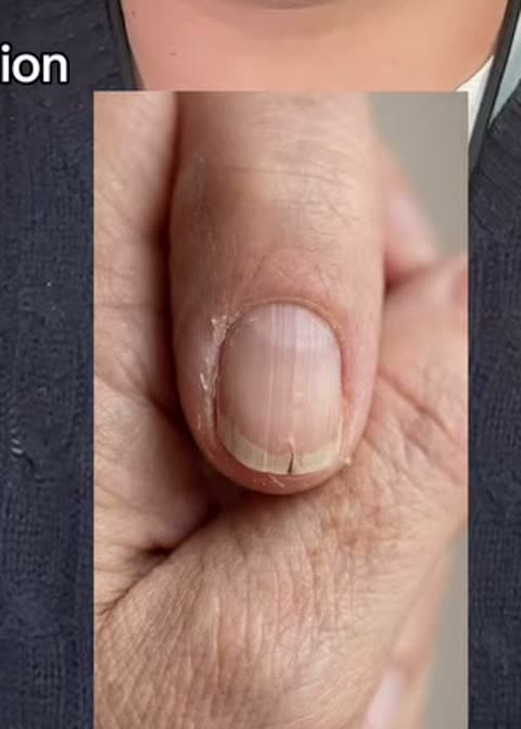
Ultra-tight photo of the problem with no branding at all. Pure feed camouflage, hook does the work.
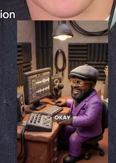
Clay characters staging the scenario. Novelty carries the stop; the format has no inherent argument.
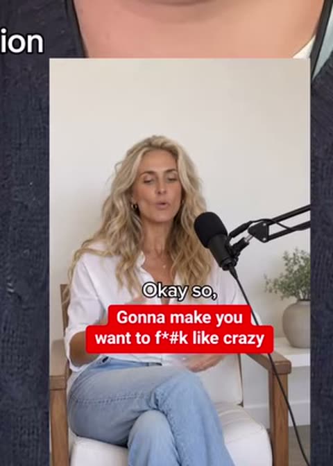
A generated host at a mic mid-episode. Wears a format the viewer chooses to watch voluntarily.
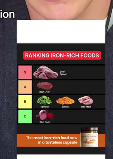
S through C ranking with the product in S. Invites disagreement, which is engagement.
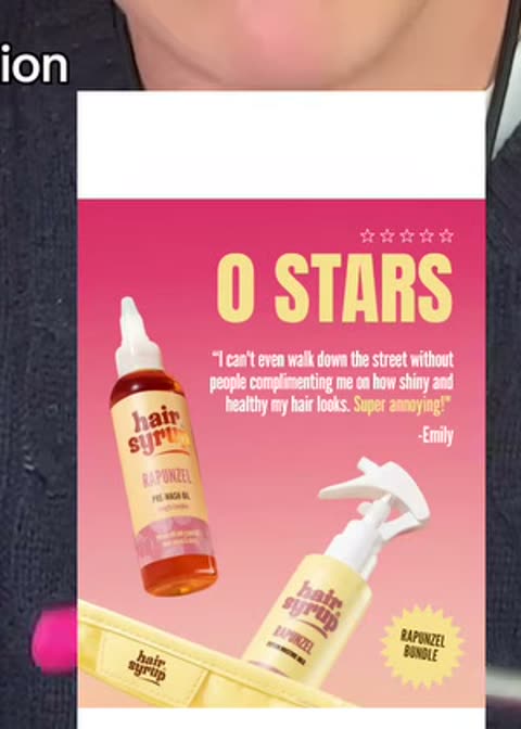
A sarcastic one-star review that is actually a compliment. Negative shape, positive payload.

Person keyed over a screenshot they are reacting to. Borrowed from the organic editing grammar.
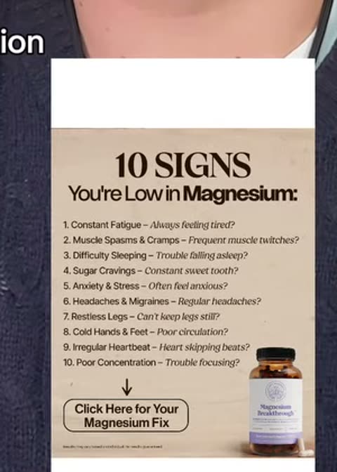
"10 signs you have X" as a self-diagnosis checklist. The reader qualifies themselves into the funnel.

Split card correcting a belief the buyer holds. Works when the myth is one they actually believe.
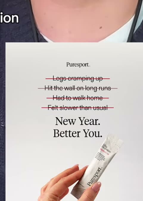
List of complaints struck through one by one. Objection handling compressed into one frame.
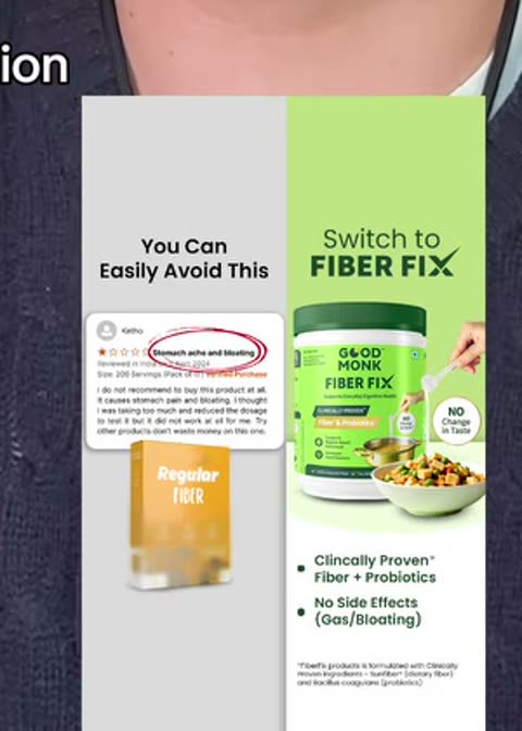
A competitor's one-star review circled in red beside your product. Their failure is the proof.
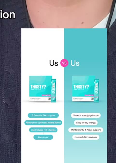
Own product against own product. Sells the range while looking like a comparison.
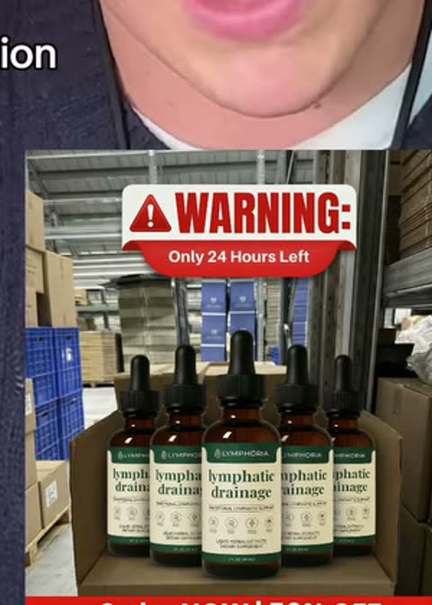
Hazard styling over a 24-hour deadline. Visual grammar of an alert applied to a discount.
Nearly all of these are one piece to camera with the prop, the location or the narrator swapped. That is what makes them cheap: you are rotating the container, not producing 58 different films. Where the format was demonstrated with a named example, that example is below. Where it was not, the card says so and the link opens a live Ad Library search instead of showing you the wrong ad.
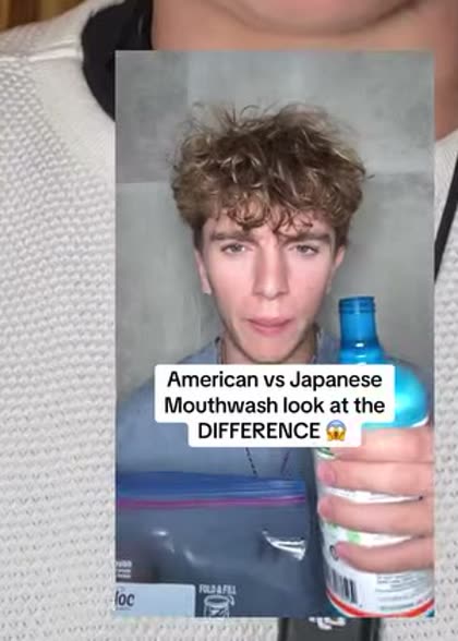
Same product, two countries, two prices or two reactions. The gap is the argument.
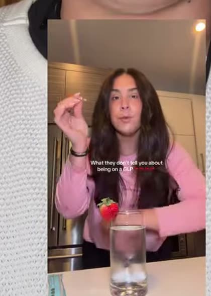
Framed as leaking something the industry would rather keep quiet.
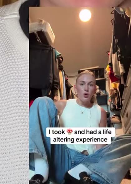
A full before-and-after story told once, product arriving late as the turning point.
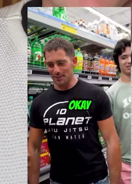
Names a rival product on camera and takes it apart.
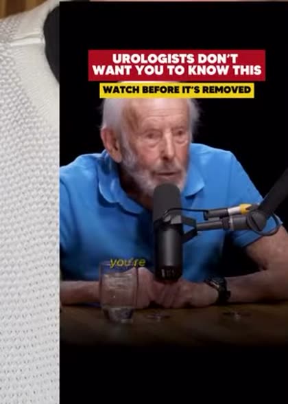
Generated podcast set. Borrows a format people choose to watch.
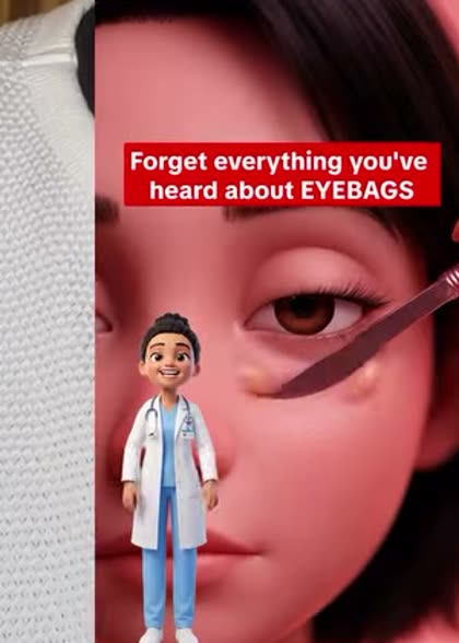
Authority figure delivering the mechanism. Check the claims before copying this one.

Clay or craft characters acting out the problem. Novelty buys the stop.

Anatomy render showing what is happening inside. Works for anything physical.

Creator keyed over the screenshot or article they are reacting to.

Product placed inside a goal the narrator already announced.
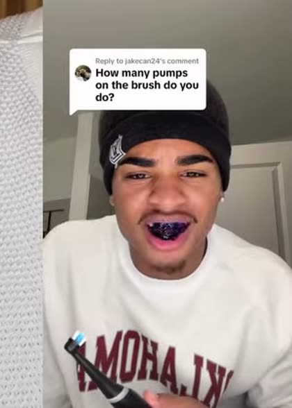
Reply to a real comment. Objection handling with a built-in reason to exist.

Walk and talk. Movement holds attention through a long explanation.

Filmed in the car. The most native-looking setting on the feed.
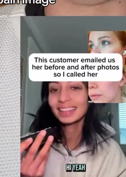
Recorded call with a real customer. Proof you cannot fake cheaply.
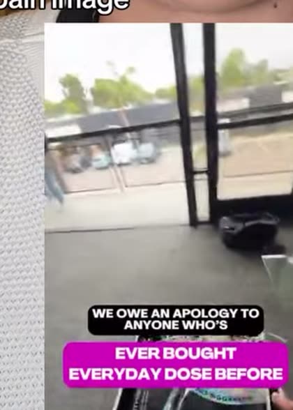
Apology video where the thing being apologised for is the benefit.

Vox pop. A stranger's answer becomes the hook.

One surprising fact, then the product as the response to it.

Leads with the fact that it already spread. Social proof as the opener.

Regret framing. The lesson is the hook, the product is the lesson.
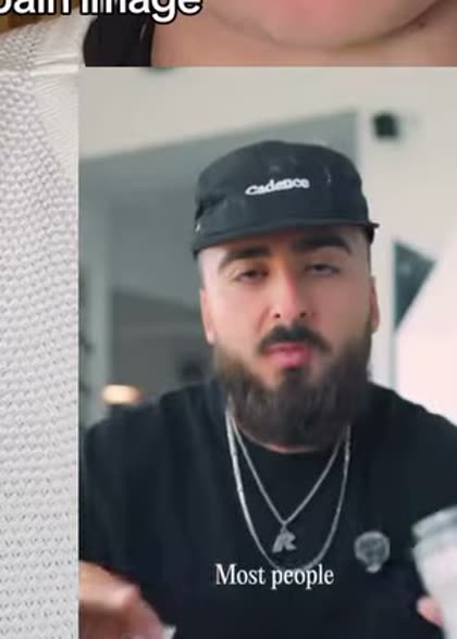
Teaches something real for most of the runtime.
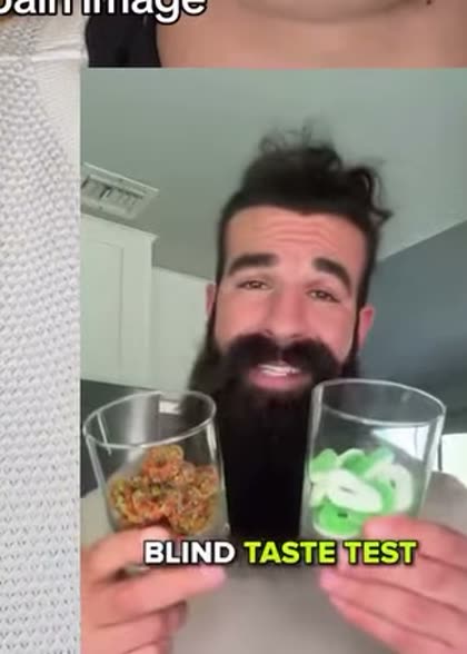
Unscripted reaction test. Works when the product wins on feel.
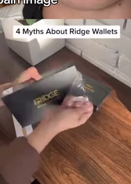
Numbered myths knocked down on camera.
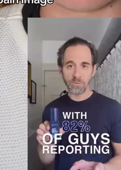
Numbers on screen, narrated. Needs a real source.

Wall of text read aloud. Ugly, high completion when the text is good.
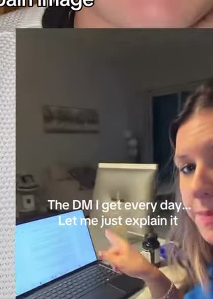
Answers the question the brand gets daily. Pre-qualified objection.

Confession opener. High stop rate, only works if it is genuine.

Skit with a doctor character. Watch the compliance line.
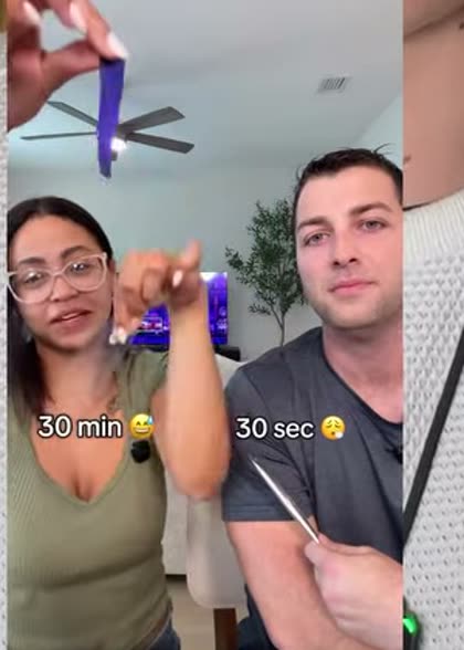
The slow way against the fast way, timed on screen.
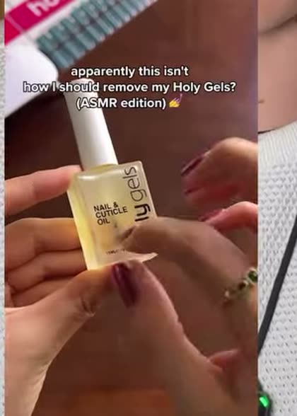
No voice. Product sound carries retention.

Something visually odd runs while the boring explanation is delivered.

Warning framing over a normal offer.
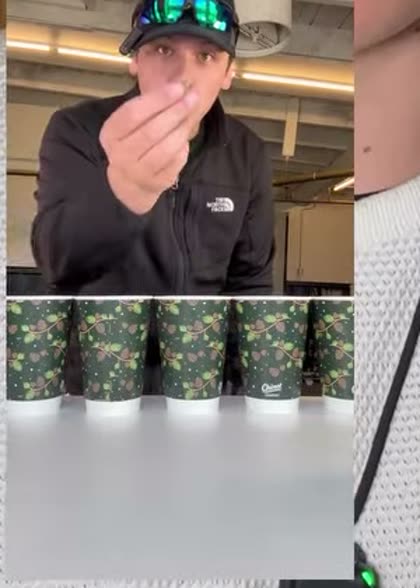
Reads the competitor's label out loud.

Get ready with me. Product appears inside an existing routine.
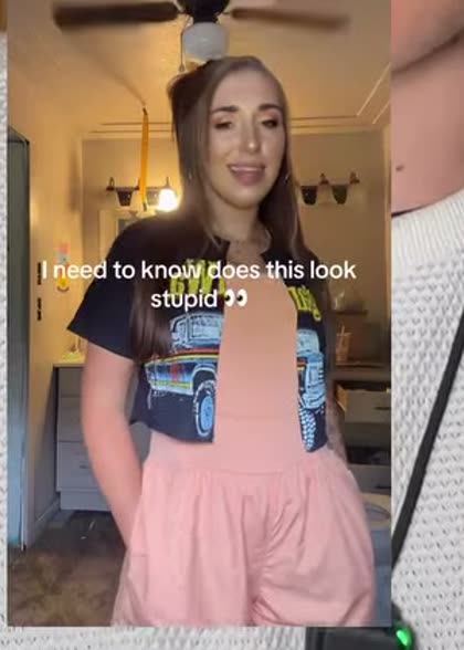
Rhetorical demand that sets up the answer.

Announcement energy applied to a launch or restock.
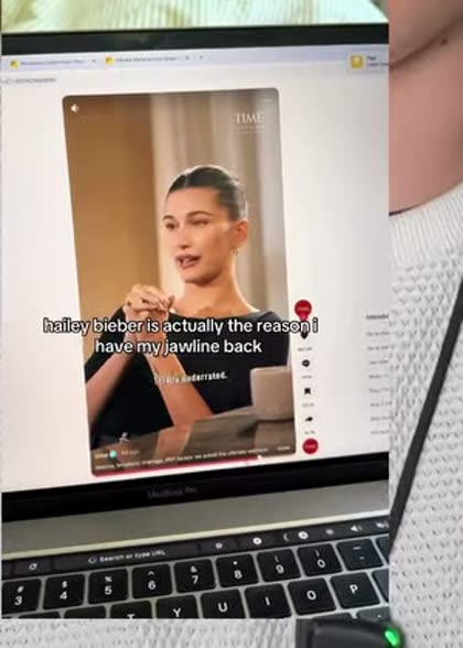
Screen recording. Right format for anything software.
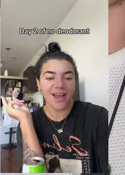
Day N of a streak. Serialised, builds a reason to follow.
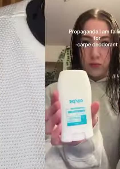
Creator admits they were sold. Confession instead of recommendation.
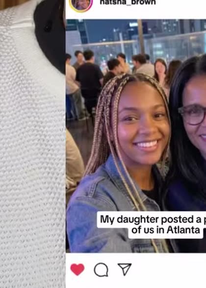
Screen-recorded IG post. Borrowed organic credibility.
Hold the audience and the message fixed, rotate the format. Five formats against one message tells you which container people accept before you spend anything testing a second message.
Cold traffic gets camouflage, the formats that look like something a person posted. Warm and retargeting audiences get claim, compare and proof, where the viewer already knows the brand.
Every link opens that brand's live library. If the format has disappeared from their account, it stopped working for them. Ten seconds of checking saves a week of production.
We pick the formats that fit your offer, build them, and rotate them before the fatigue shows up in the numbers. Start with the free audit and we will tell you which formats you are missing.
Static examples are frames from an August 2026 format teardown, cropped to the ad being shown. Video examples come from the same teardown and are only shown where the example could be identified with confidence: 39 of the 58. Formats marked works for property translate to Dubai real estate with the proof swapped: receipts become service-charge maths, transformations become handover timelines, low stock becomes units left in the release.